The following is the curatorial essay written by Camilla Pigato about the series The Maps of Time and Rome.
Behind the visible form of a city lie infinite possibilities of meaning. Beneath a geographical map, which fits together streets, squares and buildings, a silent web of memories, emotions and bonds with places is woven. It is an emotional rather than topographical dimension, one that takes shape within each of us while those spaces continue to exist in their physical form.
Twenty years ago, I got on a plane in New York and flew to Rome, beginning an adventure I had no idea would take me where it did. I certainly didn’t imagine that twenty years later, I’d still be here! So, for my Romaversary, here are 20 things of many that have made these years […]
La città non è solo cemento (The city is not just concrete)
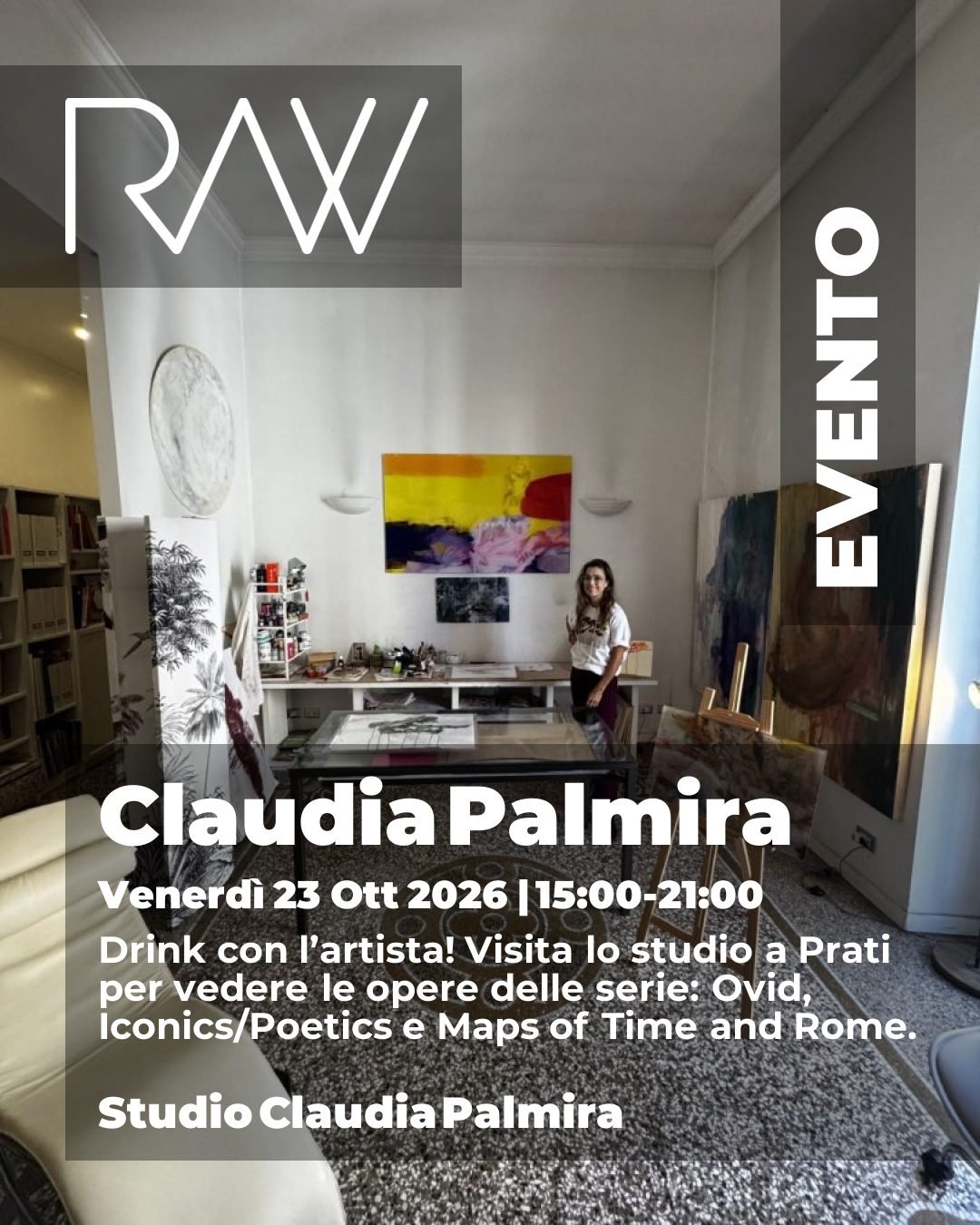
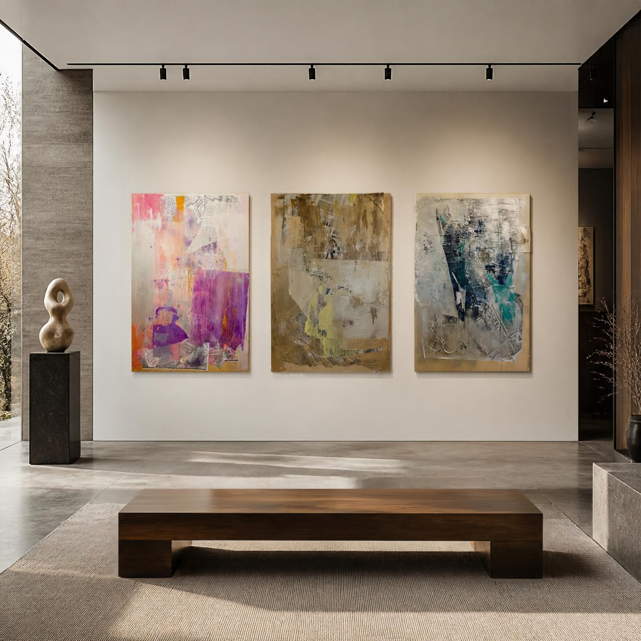
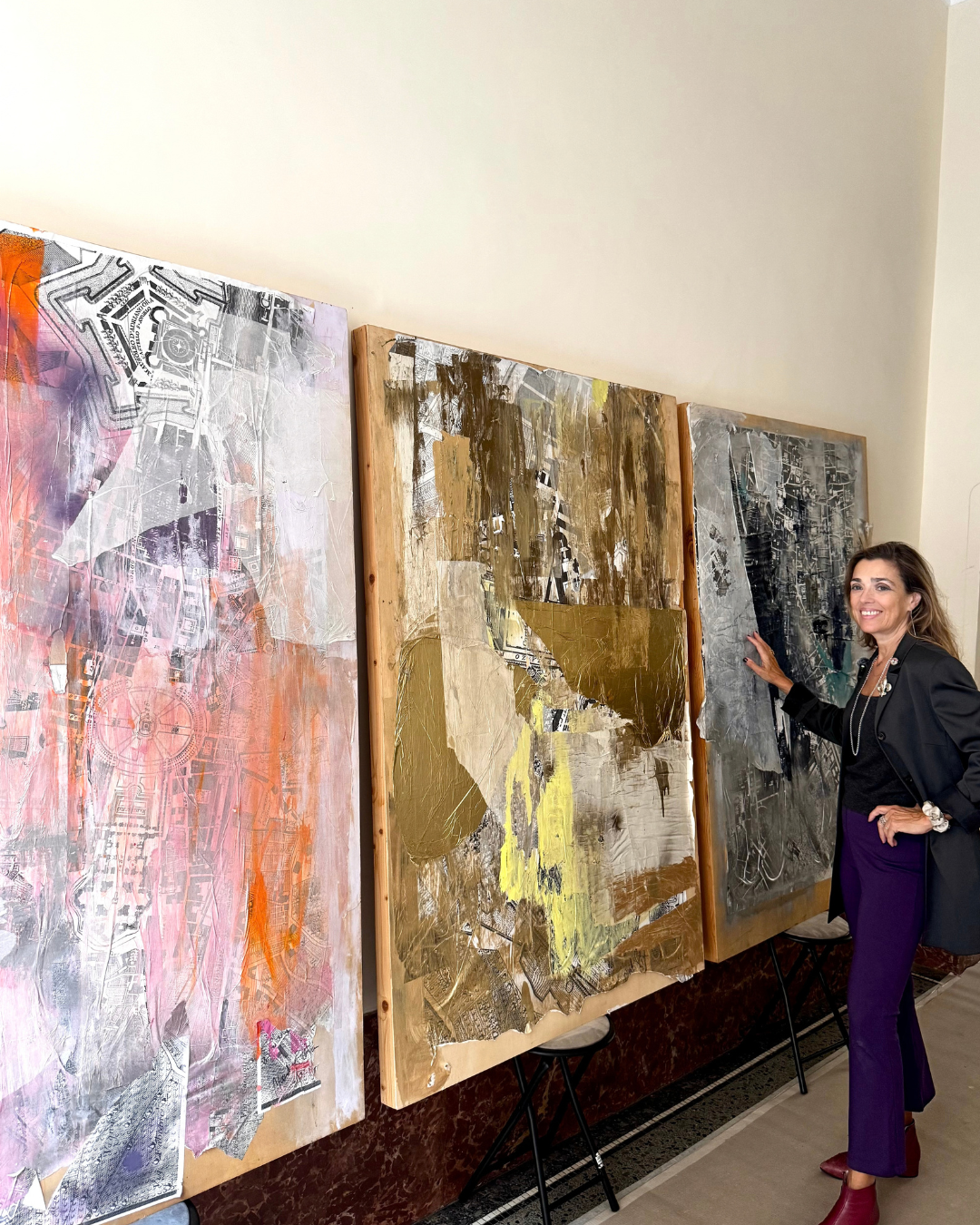
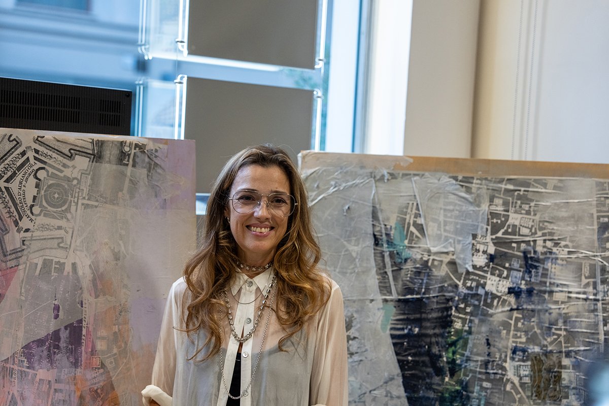
Three works from Maps of Time and Rome are on view in Prati: Centro pink, Roman night and Centro Gold.
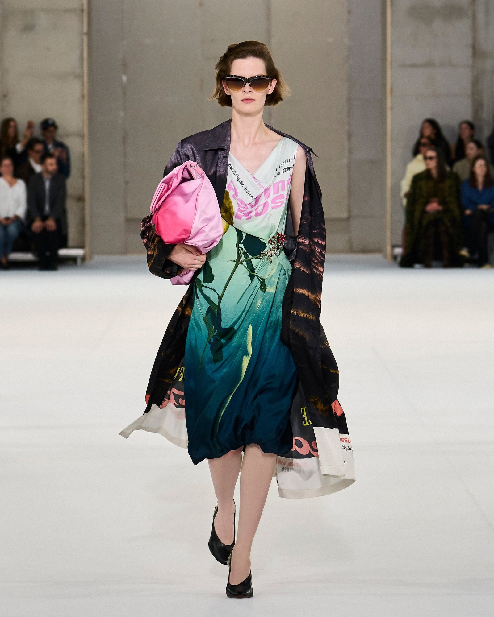
The Parisian master of color has delivered once again. Dries Van Noten and Julian Klausner’s Spring 2027 collection inspired my artistic eye. I loved the printed dresses, and the way slouchy, easy shapes were paired with structured pieces. The palette had bright pops of pink, swatches of color and pattern layered one on top of another, with the appearance of stars scattered throughout like confetti.
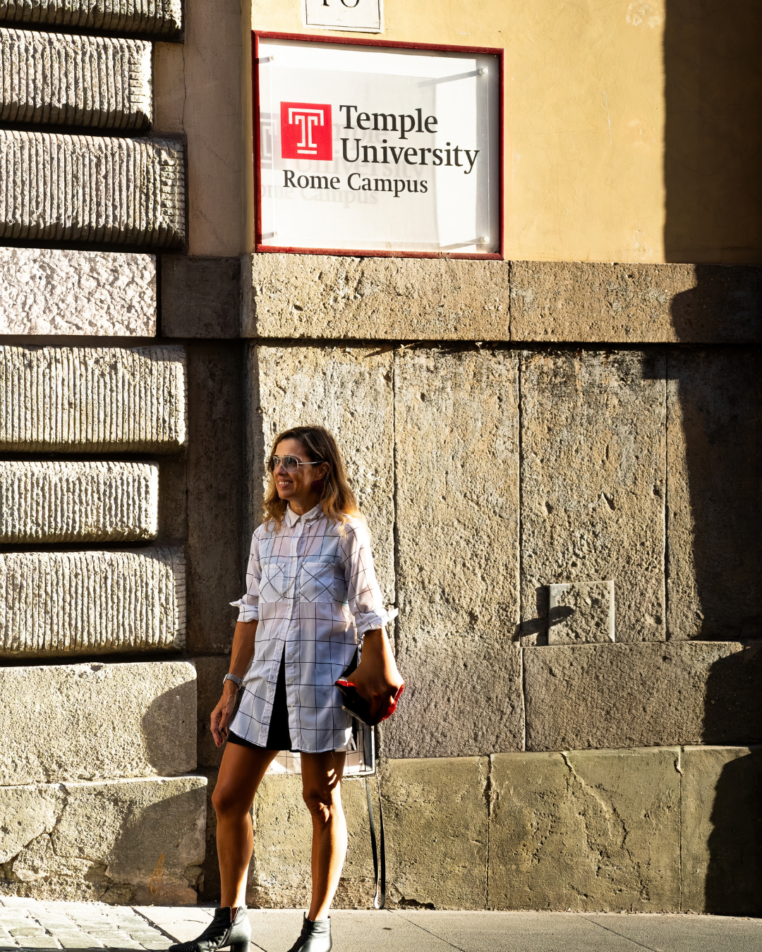
While the Venice Biennale is winding down, Temple University’s Tiny Biennale is happening in Rome. Celebrating the University’s 60th anniversary, the exhibition brings together artists with the theme of Memories.
Everything is always becoming something else.
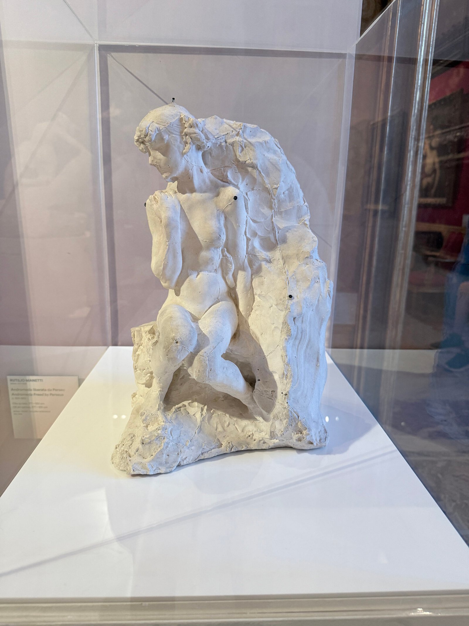
Ovid’s Metamorphoses has inspired centuries of artistic imagination. Filled with his interpretations of the Greek myths, the Latin opus has touched my own work. I could barely wait to see the show Metamorphoses: Ovid and the Arts at Rome’s Galleria Borghese.
This year, my family and I traveled to Sardegna for the month of August, as we did last year. I set up my pop-up studio there, and observed my surroundings, more familiar than the first time. Last year’s eye was fresh, all was to be discovered. This year’s experience was a deepening of my observations and intimacy with the place.
Magazine and publication design is dear to my heart. Besides being an art director, I have had the role of editor during several phases of my career.
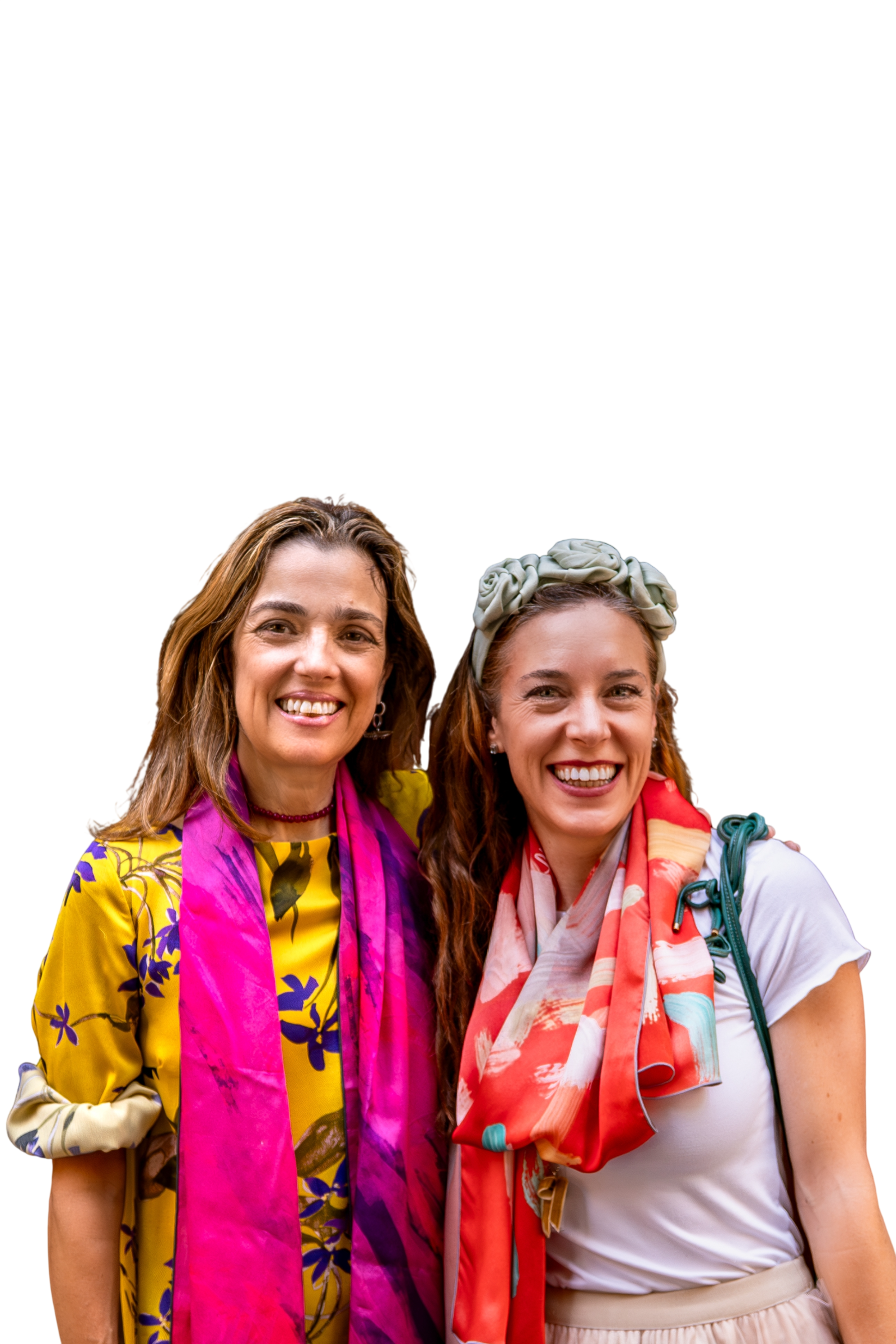
To pair with my brand Clù, this summer we launched Scarfissima, a new editorial project dedicated to silk, art and people with flair.
When this project came across my desk, I was immediately intrigued. As VP of Creative for Beacon Int’l, a publishing conglomerate, I am charged with executing major branding and graphical projects throughout the year. Each one presents an opportunity to reach our audience in a new way, tell new stories.
In this series, the goal was to tell the story of America through the history of insurance, on the occasion of the 250th birthday of the country. We decided to design a documentary video series, which would be offered for free online at Business Insurance.
Pierpaolo Piccioli is one of my favorite creative directors, and I’ve written about his work before. His recent debut couture show for Balenciaga has once again he has thrilled my design eye.
People will see a Matisse painting and say, ‘My own child can paint like that’, not realizing that’s the whole point of what Matisse was trying to do. He was trying to get back to pure emotion. A great artist doesn’t need much to show everything.
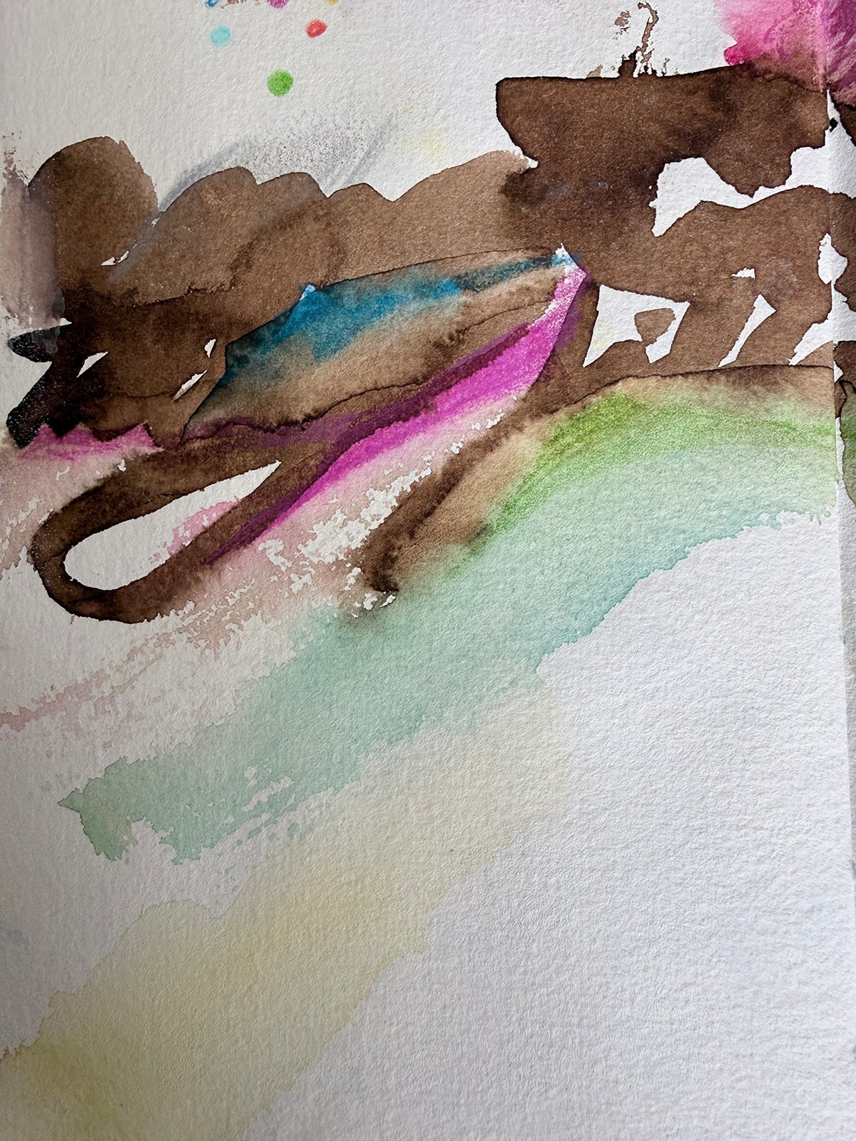

My Artistic Gift to You
Receive the newest ICONIC artwork and the latest ideas in my Compendium, each month – as my artistic gift to you