Praise for Maximalist Packaging Design
Packaging design is a tricky art. Like all graphic design, it combines a commercial mission with an artistic vision, and balancing the two is the designer’s challenge. Yet packaging design truly lives with you – whether it’s coffee, moisturizer or bottled water. It must communicate an immediate feeling from the store shelf or image on the screen – a feeling that makes you want to own it and be connected to it. Every brand has this intent, but in packaging design, this effect is even more pronounced. The success of a great packaging of course is in the quality of the product – no one likes to be fooled by a pretty exterior and find something mediocre inside.
From the product to the boxes that contain it and the labels that adorn it, every detail is finely tuned and has a distinct purpose in representing a brand. A truly successful company will have a consistent perception and brand imaging across all platforms. As a businesswoman whose heart is rooted in design, I am constantly searching for products that are able to encompass bold packaging to match their identity. Encompassing a brand’s reality in a striking and beautiful design is a challenge few have mastered. Two product designs that have consistently caught my attention for their style and authenticity are Ortigia Perfume and Pukka Tea. Both incorporate a maximalist style that breathes fresh life into this genre after a long trend of super minimalist design in packaging – which even I embraced when I designed the look for Suki’s Naturals Skincare.
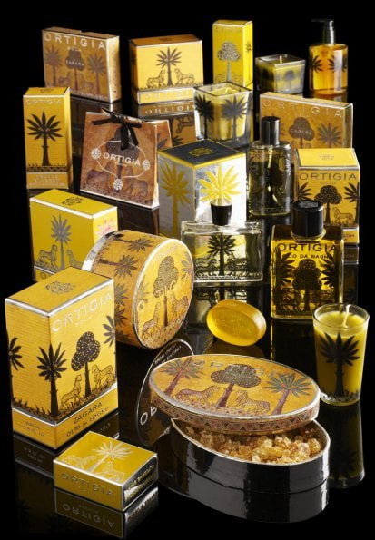
Ortigia perfumes and soaps is a company that perfectly epitomizes their brand through design. Founded in Italy, the brand relies heavily on the eponymous small tropical island for its identity – through their scents, graphics and feeling. With persistent imaging of regal, stylized leopards and tropical palms, Ortigia captures the luxury of small town Italy. The colors are gold and black for the main elements, with varying themes in other lines: sun-baked red and orange; wild pink and purple like exotic fish. The end result: you are transported to Ortigia as time slows down and you lose track of what year it is: dark island nights, days of luminous, southern Italian sun, ancient pride, and sensuality, old world opulence.
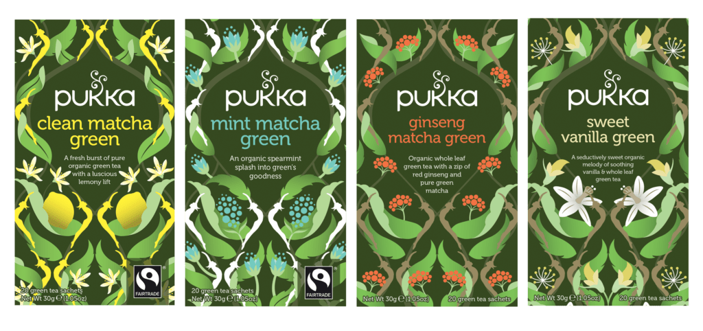
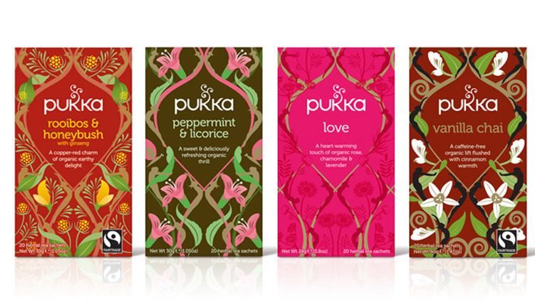
Whenever I see the packaging of Pukka Organic Tea, I am immediately impressed by its powerfully quirky colors and rich patterns that draw me in and create curiosity about the tea inside. Every flavor brings a new wallpaper on its box to match. Pukka’s brand vision is to provide every one of its customers with a life of health and happiness while helping the planet – embodied in drinking organic tea. Each of their tea lines is represented by a vivid color scheme and a pattern that invokes the tea’s flavors in a wild, repeating motif – invoking mystery, nature and adventure all at once. These boxes invite you to sit down and “figure them out”, imagine yourself in India, or just reflect on the power of simple herbs – perhaps while sipping your tea. The swirling curl design intertwined with a variety of greenery and foliage to match the flavor of tea is a sense of wonderment that Pukka brings across all platforms.
Both Ortigia and Pukka embrace designs that infuse the culture, mission and feeling of their respective companies with stunning visuals. Engaging a target audience and spreading your message to customers can only begin by catching their eye. Following through with a great product creates a loyal client.