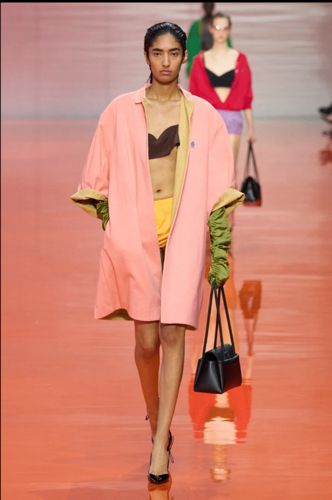
The Palette of Prada (Spring ’26)
Fashion Week provides me with a font of inspiration. This season, two collections captured my eye: Bottega Veneta (the feathers!) and Prada for the color.
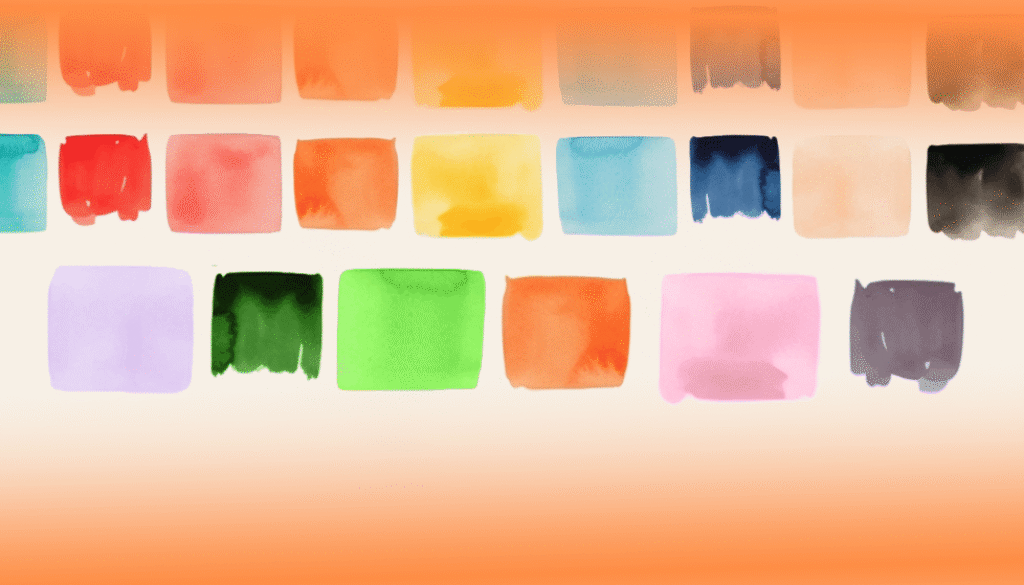
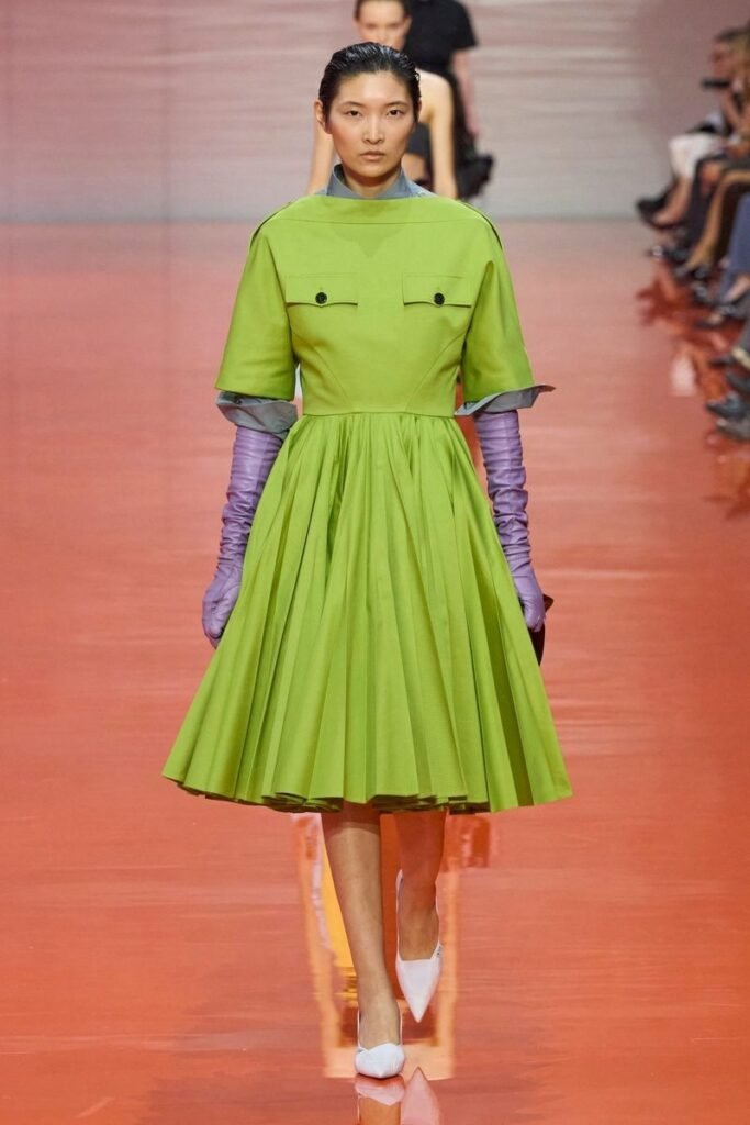
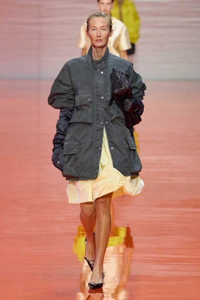
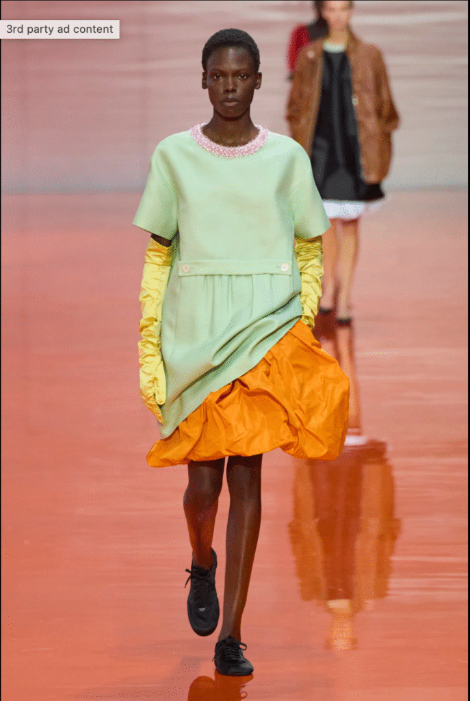
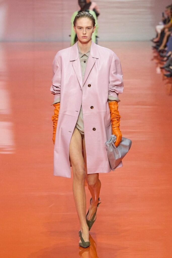
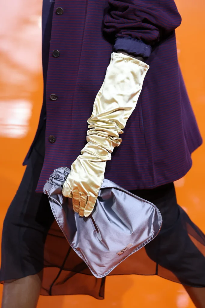
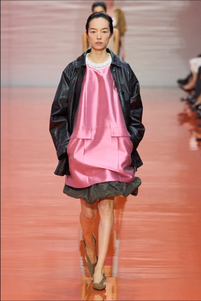
Set against a luminous orange flooring, the collection of oversized dresses and poof or pleated skirts, long gloves and aberrant trenches, was not my main focus. Instead, I was bewitched by the color pairings. Sharp lime green cut through the noise, paired with lilac and pale pink. Butter yellow appeared throughout with its easy partner, anthracite. Cool greys grounded the collection, while flashes of pistachio, purple and beautiful pink felt fresh. Against the orange runway, each color seemed to shift, becoming brighter, softer, or more defined depending on what it was set beside.
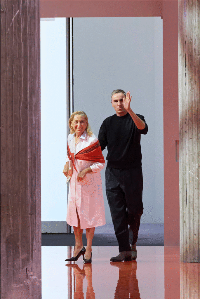
The whole palette worked like a painting in motion. It was clever – a reminder of how much story color alone can tell. The crème della crème was Miuccia Prada herself emerged wearing a pale pink dress, stillettos and a smart red scarf around her arms. Brava Mrs. Prada!
