Keeping an Audience’s Attention | Web Design Breakdown
Listen to the audio version read by Claudia:
Did you know that for the past 3 years, the majority of online traffic comes from mobile devices? Because people are visiting sites on mobile devices, they are actually spending less time on the sites versus on their desktop.
Capturing the attention of your audience on your website puts the spotlight front and center on design – specifically user design and feeling. A strong social media presence alone will not set you apart if your website is out of date.
No, a true game changer is a beautifully designed site that is easily navigable, smart, and captivating – that functions on any device.
So, how do you keep the attention of your audience without stripping away too much content? For a litmus test, I checked out a few of Italy’s top home design companies for a website comparison. Below, I break down the aspects that I believe make each site a winner – and what needs updating for the current user.
These companies are renowned for their furniture and industrial design, so I was fascinated to examine their online presence: Kartell, Poltrona Frau, Minotti, Arflex. Each site receives my report card based on different aspects of the design, with the top grade being 5 hearts.
WEBSITE BREAKDOWN
Rating 1–5 hearts, 5 is the highest rating
KARTELL
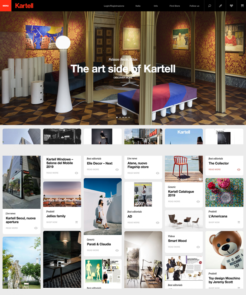
Kartell made its name in fun, contemporary design objects that have a universal appeal and functionality. This is the company that makes Philippe Stark’s Ghost chairs, and the iconic “Componibile” storage system designed in the 1970s and still resonating with audiences. Arriving at their site, the visitor gets a bright photo slider, overlaid with bold headlines from recent news and content. Scrolling down, there’s a Pinterest-type feed of stories withimages. This is a fun way to present content, especially to a younger visitor, even if it has a bit of a copycat design vibe. Clicking on any of them leads to a page with the enlarged pill-shaped content teaser and text below it. While the Pinterest feed is fun, I found my eye roving the page with an unclear focus. It took several clicks to arrive at the “Icons” section of the site when searching for the classic designs which made the brand famous. I imagine these objects showed more prominently on the homepage and navigation. The format adapted well to mobile, where the content seemed more contained, though some of the typographical impact is lost in that format. There are two navigation menus on the desktop – one is on the page header, the other slides out on the left in red. Note to the developer: the site needs to be placed on a secure server!
DESKTOP 4 | MOBILE 4 | TYPOGRAPHY 4 | NAVIGATION 3.8 | DESIGN IMPACT 4
KARTELL OVERALL: 3.9
POLTRONA FRAU

Like many home design sites, the first impact of the Poltrona Frau homepage is thanks to a slider of lush photos paired with editorial headlines, in this case, quite originally written. This company, known for its elegance and luxe statement pieces, immediately distinguishes itself with the use of a serif typeface, an unusual choice compared to many in the genre. The soft background color adds warmth and feels “inside”. Scrolling down, objects float and then land in place, offering links to the company’s main sectors. Delving into the site, I found it surprisingly wordy – almost more a magazine than design house. One excellent aspect of the site is its menu navigation tool. Clicking on the top menu provides an array of ordered links, allowing the user to navigate very specifically to desired content. This easy-to-find-content feature appears also on many of the sub-sections and pages.
DESKTOP 4.3 | MOBILE 3.5 | TYPOGRAPHY 4 | NAVIGATION 5 | DESIGN IMPACT 3.8
POLTRONA FRAU OVERALL: 4.1
MINOTTI
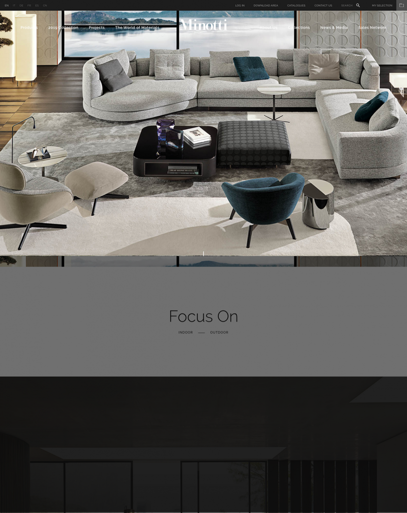
The photography on the Minotti site immediately immerses the visitor in its lush interiors – inviting one inside their world through a full screen photo slideshow, notably without textual descriptions cluttering the view. The logo and navigation appear on top of the image in white, which depending on image can recede and become illegible. As the mouse scrolls down the homepage, it seems “magnetized” to the start of each section, which then appears from a dark screen, as the sections before it fade away. Each section is represented by a full-width interior photo. The result is a highly controlled experience, and the sense that the design aesthetic takes precedence here – it’s non-verbal. Clicking into product pages, I found them to be clearly laid out, with plenty of white space and visuals, both of the piece itself, fabric, and even blueprints, which adds a highly artisanal feeling.
DESKTOP 5 | MOBILE 4.5 | TYPOGRAPHY 4 | NAVIGATION 4.8 | DESIGN IMPACT 5
MINOTTI OVERALL: 4.7
ARFLEX

Arflex is not necessarily a mega Italian brand in the international sphere. However, their site has several features that are wonderful – and therefore had to be included in this short survey. On their inside pages, they display miniature photos of their products (or headshots on their architect’s page), which are fast-loading and likable to the eye. These doll-like views transform the furnishings into icons, which are very appealing and easy to visually read – and render the same on mobile. Another great aspect of this site is the bold typography and use of white space throughout, combined with a really facile navigation system. The simplicity of this site won me over despite its left and right margins – designers tend to use the full-width feature on browsers now. If only their developer would put it on a secure server!
DESKTOP 4.9 | MOBILE 4.9 | TYPOGRAPHY 5 | NAVIGATION 5 | DESIGN IMPACT 5
ARFLEX OVERALL: 4.9
CONCLUSION
When creating your best platform, it really is a blend of individual personality and tech-savvy design. An expertly-designed and responsive site can make all the difference for your brand, business, artistry, and everything in. I hope this breakdown helped you find insight into the different strengths that can be found in your site.
If you’re looking to make a change in your site, start from scratch, or anything in between, I’d love to help you. You deserve the best site possible, so, let’s get you there.