New design takes time
Like fashion, graphic design has its trends and seasons. Website design styles last about one or two years, thanks to speedy evolutions in the tech world. I am passionate about fashion – in clothing, interiors and graphics. Technology combined with changing aesthetic ideas make web design exciting for me, as I love combining the two – and then rethinking the whole thing again!
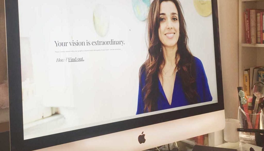
The hardest project I ever work on every couple of years is my own site. Over the years I’ve had the opportunity to see my agency grow and take on a completely different life form. I’ve had the privilege of working with a large array of clients, and I have grown as a designer. However, when I viewed my own website as of late, I did not see this same designer represented on the screen. I knew it was time for a major upgrade!
Good design takes time and it’s a process of understanding not only what looks good, but also what pulls it all together. It’s hours of contemplating what works and what I want to work. After countless hours and a myriad of work, though I finally reached the point I was looking for and the design that fits my style – but most importantly, is functional!
So what is new on my site ? Well… a lot! Let me break it down – as these are also the elements I incorporate in my clients’ websites.
Overall Design
A new, simpler design with large typography, bright colors and clearly-delineated sections makes it easy to navigate and find what you need – and what you want to know. I used two navigation areas – one at the top left corner, where most users expect to see the menu; and another at the upper right, accessible only by clicking on the three-bar symbol.
WordPress
All my sites are now built in WordPress, including my own. The flexibility of the platform, as well as its universal accessibility, makes it an ideal medium for a designer and my clients, who always want control of their content and maintenance.
Responsiveness
More and more users browse the web on their devices – small screens, medium screens and sometimes large. The site is responsive – which means it works on all screen sizes. The photos and content adjust to the screen size, as do the menus.
Photography
A personal website without great portraits is lackluster. After creating a Pinterest board with my favorite portraits and looks, I contacted my friend and collaborator Suzanne Preparata to take some my professinal portraits. Suzanne oversaw the styling and lighting and was brilliant during the shoot to help me relax and “shine” for the photographs. I ended up with at least 5 or 6 portraits that I love – and they are on several pages of this site. These images of me were to convey warmth while matching the style and feel of my brand.
Copywriting
I always emphasize to my clients the importance – the urgency! – of having good copywriting. I can make the type look great, but unless the words convey a smart message, the design won’t resonate. This is why I worked with a pair of writers, who collaborate with me at the Rome Design Agency. My copyediting skills were put to the test as I honed their words and injected my own voice, smoothing rough edges. The copywriting took time – but deserved every minute of my attention. I hope you agree!
Typography
To enhance the newly minted copy on my screen, I turned my attention to the site typography. I kept my overall typographic logo look – hinging on a bold, feminine serif, but changed the font to one that had some weight to it. My logo has always been in black, so this remained. My logo – a palm emblazened in a magenta circle – both remained. In this version of the site, I played with size – I wanted even those who tend to skim and not read the text to know what I was communicating. Hence, enlarged text, sections and bulleted lists.
Clear Opt-in Form and Messaging
In today’s fast-paced whirlwind of information, I realized it is imperative that all signups should be clear and straightforward. With my website’s new design, opt-in forms and sign ups are clear and to the point– but purposefully un-invasive. I avoid pop-ups in general, and try not to bombard you with promotional text (perhaps to a fault). A signup is essential, however, as your mailing list is one of the foundations of your marketing.
Behind the Scenes
You can’t see it, but this site has some tech features that are indispensible in contemporary design: First, the site is Search Engine Optimized, which means that each page contains keywords and titles, image alternatives and descriptions that allow search engines (Google and Bing especially) to easily find my site and connect it with those who might be looking for what I’ve got. Second, the site is totally secure and free of spam and malware. While this may sound obvious, it’s not. WordPress is prolific and accessible to everyone – including hackers and spammers. While I’m not sure they do what they do, I’m really fierce about protecting my sites – and my clients’. The site also contains share buttons and social media connectivity in case you want to find me elsewhere. But – as mentioned above, my email list is the top way to stay involved with what I do.
Colors
I saved the best for last! I love color – working with color daily is one of the reasons I enjoy what I do so much.
My brand palette has always been black, white and magenta.
My secondary colors are yellow and silver:
And my accent colors on this site are coral and cyan:
Next steps
As I mentioned, the design process takes time. While phase one is at last complete, I’m working steadily on phase two, which includes the site translated in two languages, Italian and German, an online boutique for shopping, and ongoing articles in this Compendium (aka my blog).
Thanks so much for listening.
xo


