Expressions in Color Matching
One of the greatest privileges and joys of my profession is being able to work with color. Color is emotion, it is light, it is an expression of life. Our eyes perceive color before we even identify shape or content.
It’s a passion of mine, perhaps an obsession. For years, I instinctively played with hues – in my design studio, paintings, wardrobe and home – relying on my own eye and intuition. Knowing what colors work together has always come naturally. My outlook was transformed when I received a color consultation from a professional colorist. She identified more than my personal palette – the sessions sparked a whole new way of thinking about layering, combining and organizing colors.
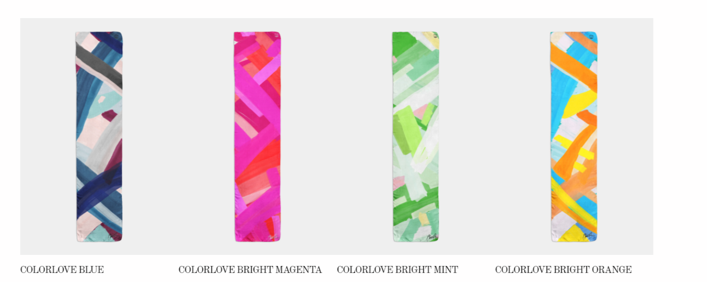
Inspired by this experience, I am now exploring more deeply the world of color juxtapositions within the different seasonal palettes. This is expressed in my luxury silk scarf series Colorlove.
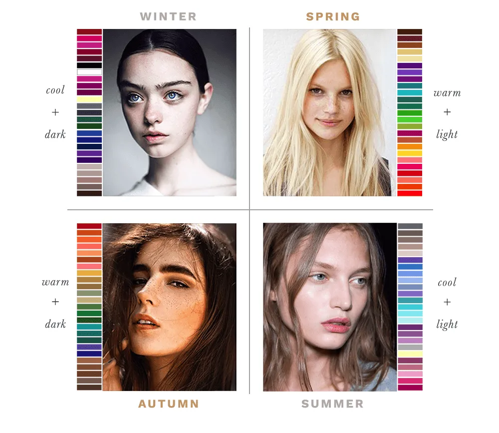
A simplistic key for color combining is to remain within either a warm or cool palette. Within that palette, pair colors that are either bright or muted. The seasonal palettes are shorthand for these attributes. For example, the Summer palette is muted and cool; whereas Spring is bright and warm.
Of course, the magic occurs in the unexpected, but this takes practice or just pure irreverence.