Designing for Luxury on Television | Platinum Eye
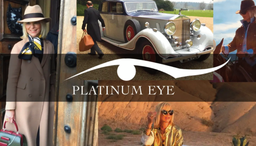
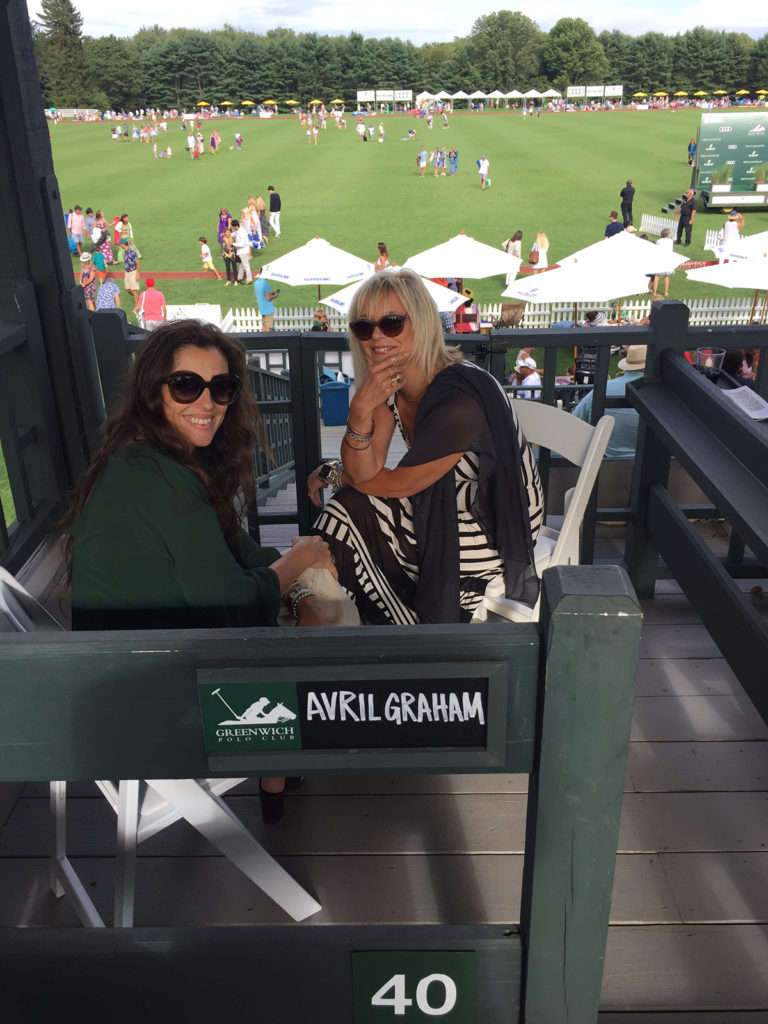
Beaches in Puerto Rico, castles in England, ranches in Montana, the red carpet in Paris – all glamorous filming locations for Platinum Eye, a new series airing for the first time November 29, 2020 on fyi,. The show had humble origins – a conversation between two dynamic women at a poolside in Greenwich: Avril Graham, a fashion editor for Harper’s Bazaar, and Carole Acunto, an entrepreneur. I was privy to some of these early conversations – the inception of the brand’s very identity.
Since then, I’ve been connected to the show’s journey and creative process as head designer and brand consultant – and even participated on the set during the London and Highclere Castle shooting. With the series premiere this week, I thought I’d take a moment to reflect back on the process and share what it’s like designing for a luxury television series, creating a visual brand from an idea alone.
Getting Started
Designing for a never-before-aired series, in some ways, is a lot like a blank canvas. What we knew was that the show was going to be based on the host Avril’s unique access to “behind the velvet rope” experiences around the world. Avril and Carole, the executive producers, my clients ultimately, desired to bring the world of excellence in design, style, food and living to their viewers, in a way that was elegant. This was to be a show appreciating glamour up close.
At the start of every design process, I have questions – like What feeling are viewers mean to have? What is the brand’s mood? What is the overall style – is it classic, femme or trendy? For Platinum Eye, our brainstorming led to some clear keywords: timeless, elegant, a sprinkle of fashion, fun. Each brand has its own unique combination – and it is that blend that is expressed in its design. The first logo was the result of a collaboration between me and another designer: the Egyptian eye of Horus restylized with a feminine upward sweep to one side. The colors – very simply: platinum, black and white.

After a year of utilizing the first logo, I was asked to refurbish the logo so that it would obtain a trademark as unique symbol. After several rounds of prototypes, rethinking the idea, the team and I returned to the eye with the upswept edge. In the updated version, I sharpened the edges, removed the Egyptian browline and extended the sweep. The result is as if the logo itself was laser cut from platinum.

Cohesive Branding
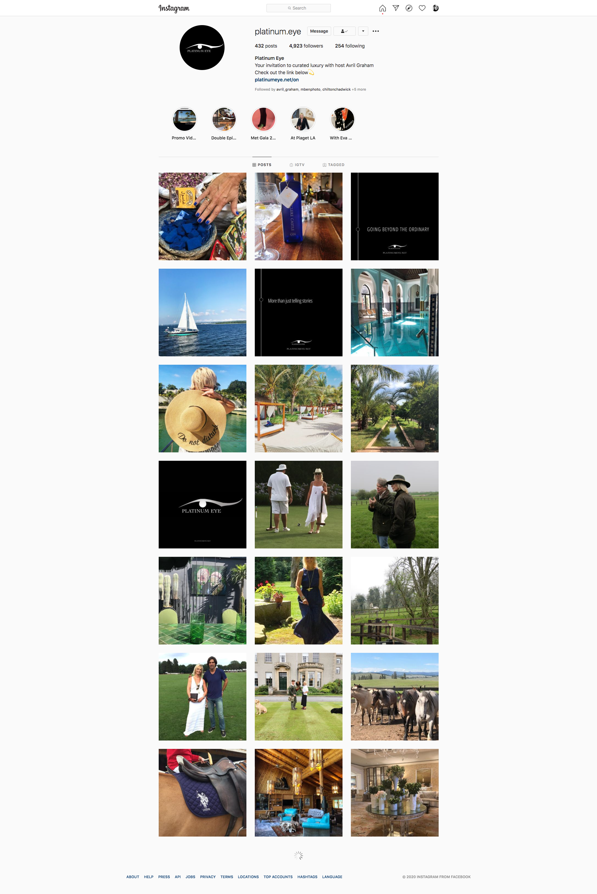
From this initial creative briefing, the web design, online brochure and sales kits, as well as the Platinum Eye Instagram page were all developed by my studio. As a designer working with all elements of the visual branding, the major benefit is the cohesive appeal between each aspect of the brand.
I can’t wait to see where this brand will go – literally and figuratively – in the coming year. After the show premiere in November 2020, the entire series launches in February 2021. Congratulations to Platinum Eye!


