Cloud Dancer | Pantone Color of the Year 2026
The moment may color lovers await, has arrived: Pantone’s Color of the Year. For 2026, they’ve chosen Cloud Dancer, which is a shade of white.
Despite the mission statement of their intentions behind this color, it has provoked polarizing discourses about it. To my eye, it feels like a palette cleanser, even a blank slate. White contains all colors, representing high consciousness, illuminating and enchanting. It’s the crown chakra, and the name suggests this connection.
Contrarily, the color reflects something highly technical and cold, like the opening screen of an AI chat.
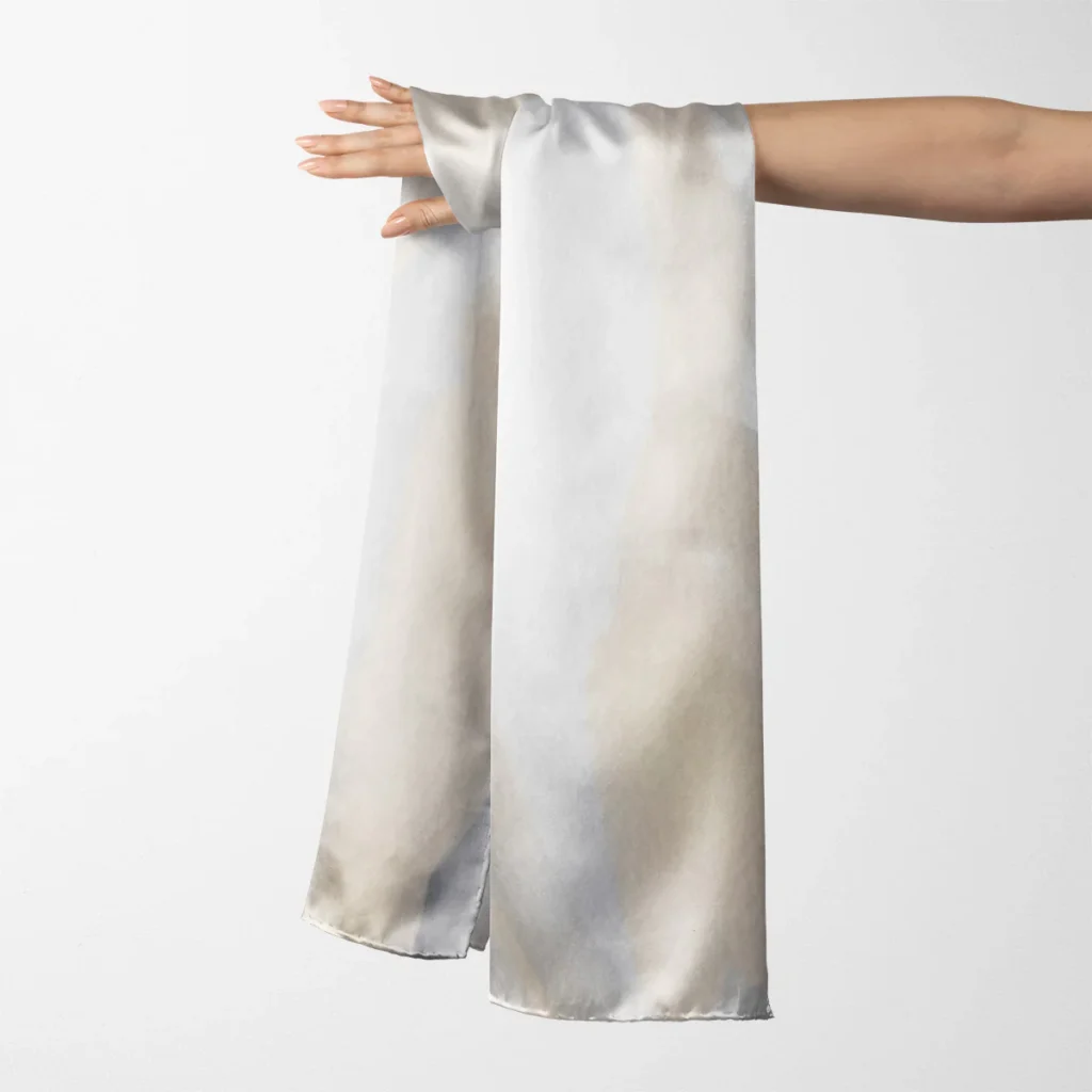
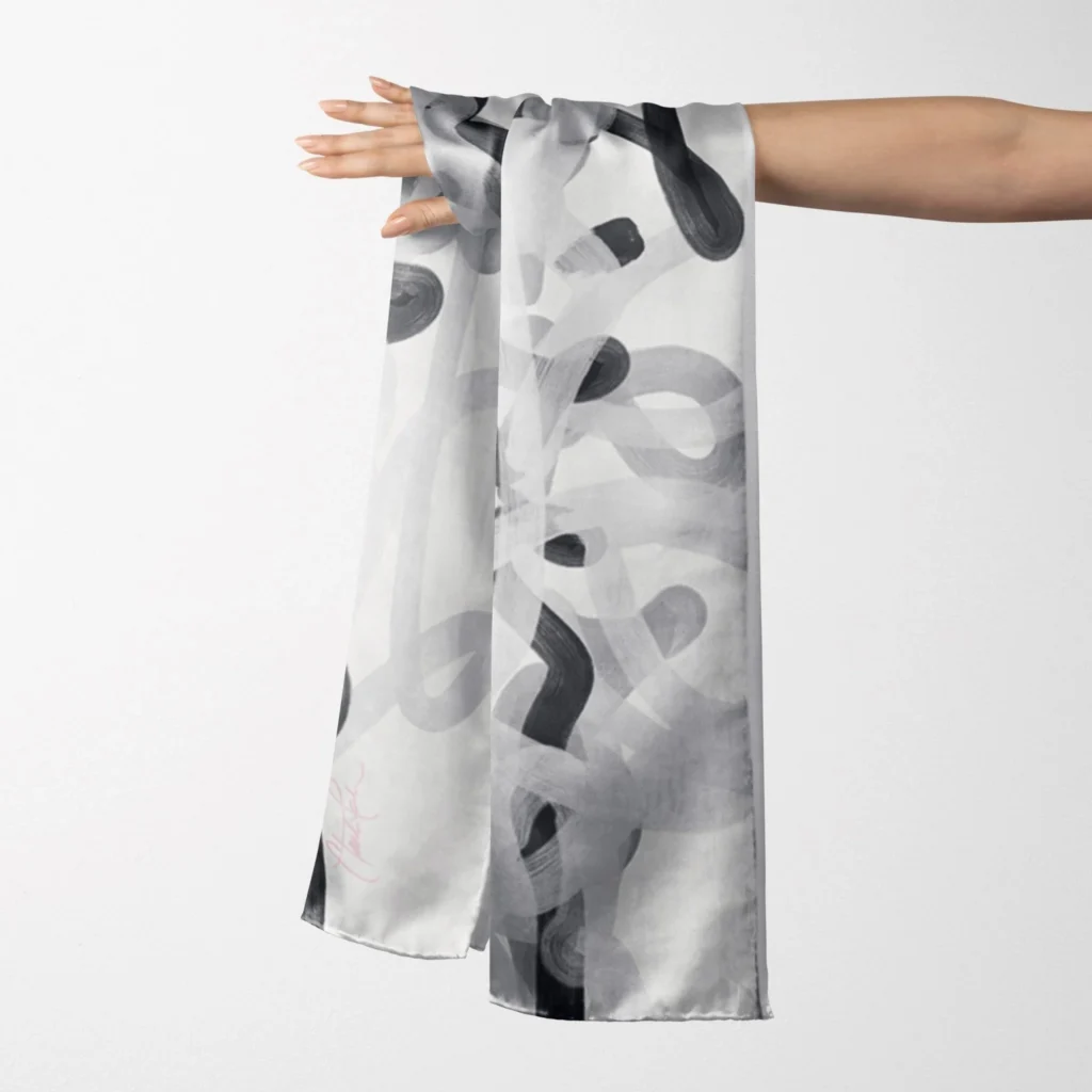
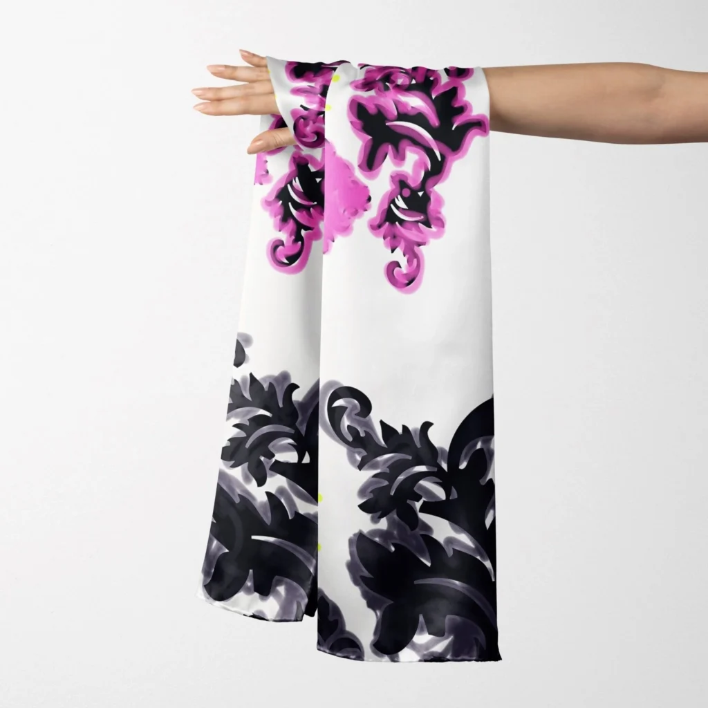
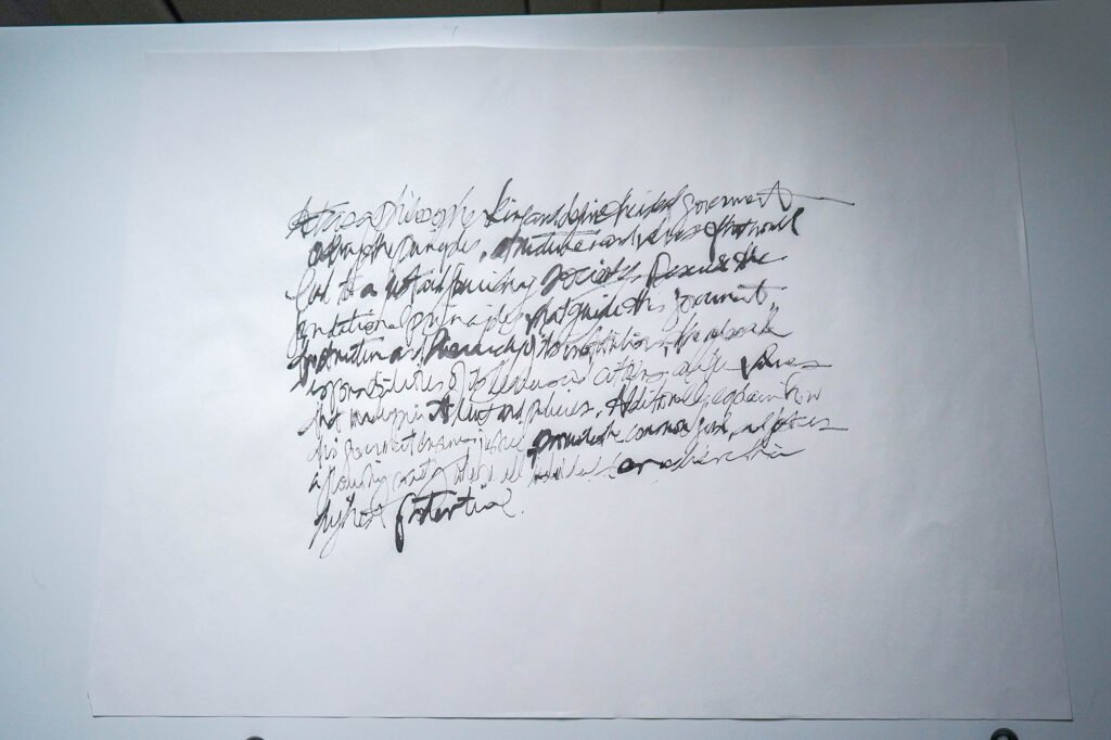
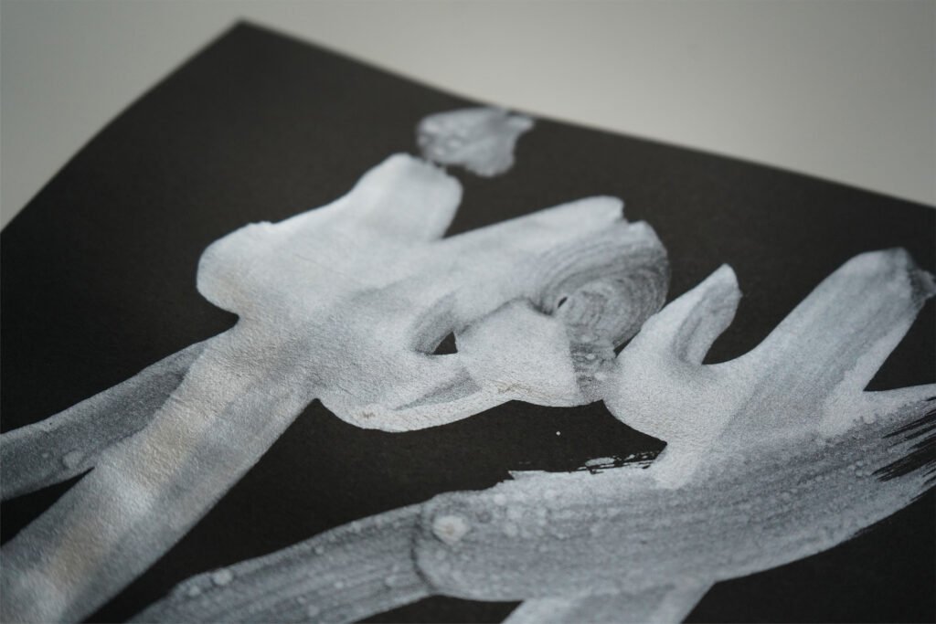
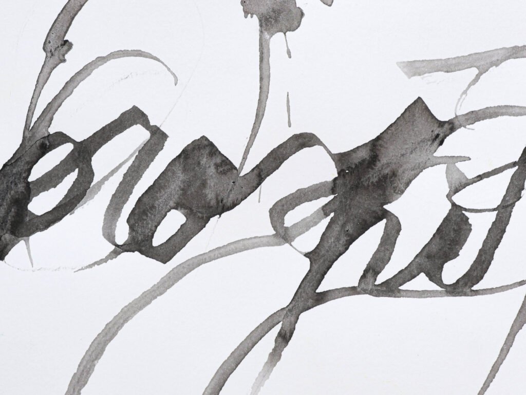
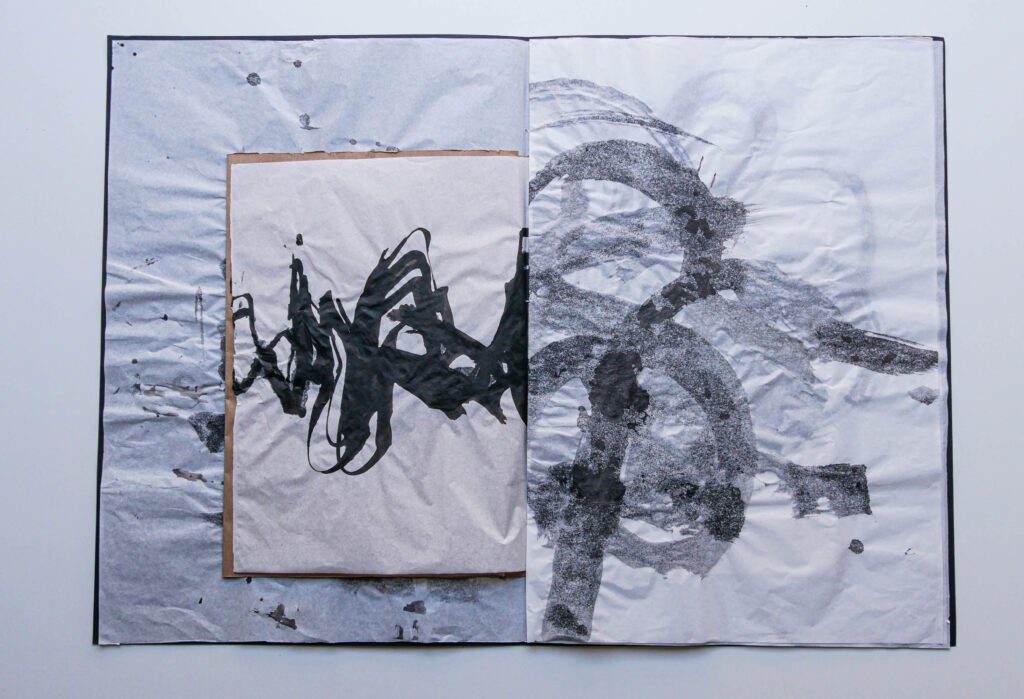
White has always played a role in my work, providing negative space, points of light, balancing color-rich palettes. It’s rarely the protagonist of the piece. The one exception is “Snow” from the Iconics/Poetics series. Several of my silk scarf designs show off this minimal “non-color” neutral. In my Calligraphic Abstractions works, the material is paper, and the marks float on this. The paper itself – often white – becomes its own presence in the works.


As a designer, the concept of white space is fundamental to legibility, beauty and visual hierarchy. While this space is not always white, the supportive role of this concept is fundamental to its nature. Now that it is a protagonist for a year, it will be fascinating to see the rainbow that emerges from the color of light.