Logo design: an evolution from hand illustration to finished graphic
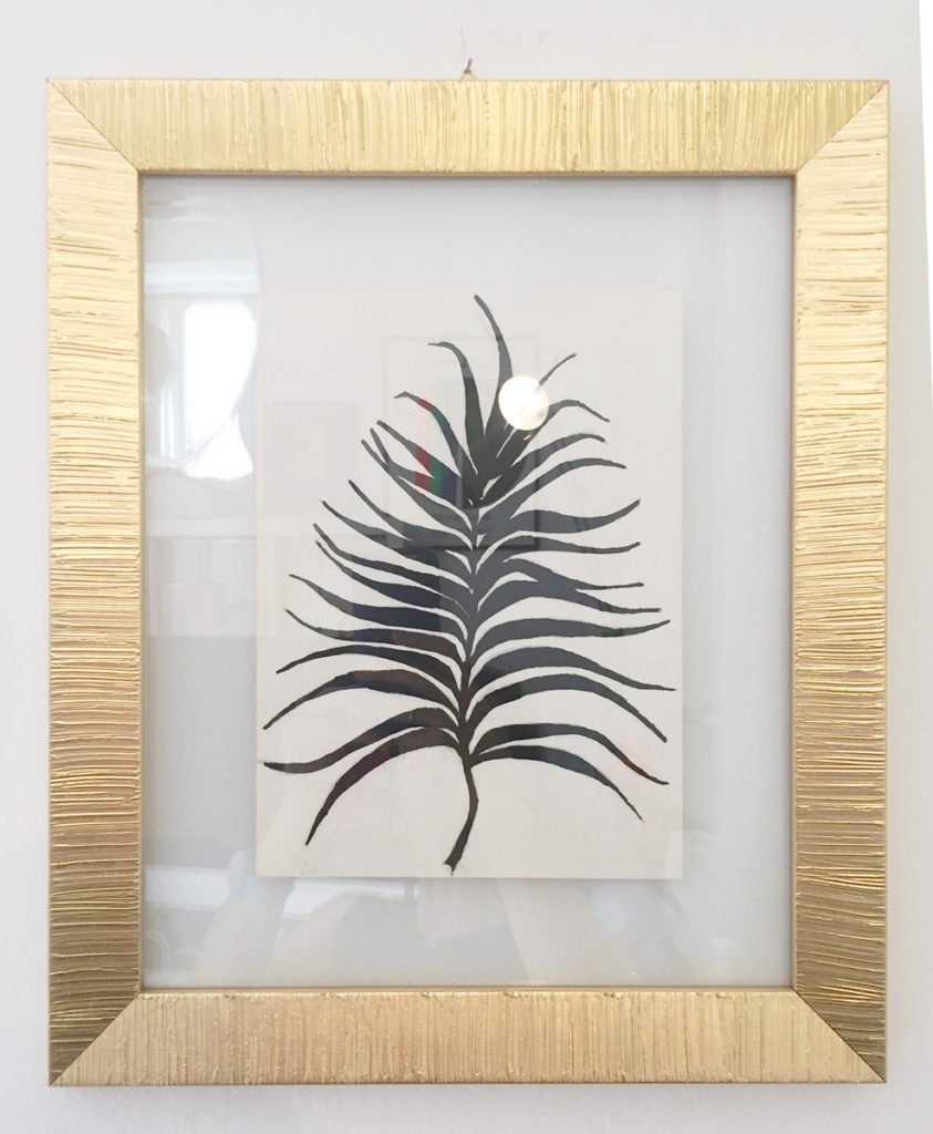
In my recently refurbished design studio in Prati (Rome) a framed illustration holds an important visual place – in the center of the large wall behind my desk. It is mounted between two glass plates and offset by a thick gold frame. How did this simple work in black ink deserve such a place of honor in my studio? In part, it’s the start of a logo development process – in this case, my own.
The drawing depicts a feathery palm frond – an interpretation of a palm leaf whose extensions have graceful curves and a feeling of movement. This drawing forms the basis of my logo (or mark), which is displayed on all my marketing and business materials.
My logo design process often begins with scribbles, visual notes and hand lettering an illustration. Sometimes, these drawings evolve into more formal elements, like my palm frond. Once I’ve finished my sketching, everything gets scanned and digitized. Then the digital sketching begins, and the logo begins to feel more official.
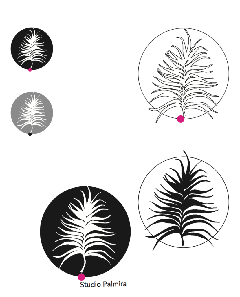
In the digital sketching phase, I play with the elements in black and white; later, I add color. I fuss and tweak, add and subtract, flip and crop – similar to how I create collages or websites. I’m constantly refining. Often the most impactful designs are the simplest; yet to arrive at the most economical visual communication requires an extraordinary dedication to the soul of the brand and its expression.
In the sketches above, I had already decided on certain key elements: the circle; the central position of the palm; and my brand colors: black, white and magenta. The typography for my name had already been established for many years – as my studio was started in 1997. This appears on my business cards, imprinted in leather in my silver portfolio cases, as a custom stamp and on any marketing material for my company:

When designing a logo, I develop a set of style guidelines: the official colors; the placement of the logos; their interactivity; and size. My own is no exception. My typography and “mark” do not have to appear together, for instance; but can be used either separately and together. The mark is always magenta, while the typography is either black or silver (grey on a monitor).
Eventually, the palm logo transformed into its final graphic. The frond was expanded so that it filled the circle and some of its leafy fingers touched the edge; its top and bottom “bleed” off, which means the color goes past the edge of the circle. The result is a sinuous and dynamic natural core, contained by a neat and powerful graphic circle – reflecting the essence of my studio and approach.
Establishing your own personal mark is an exciting process, one that I am passionate about – as it combines artistry, graphic design and marketing flair. Let’s work on yours.